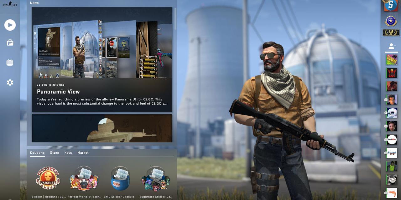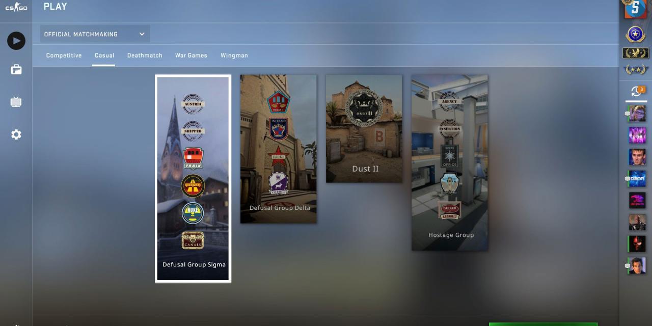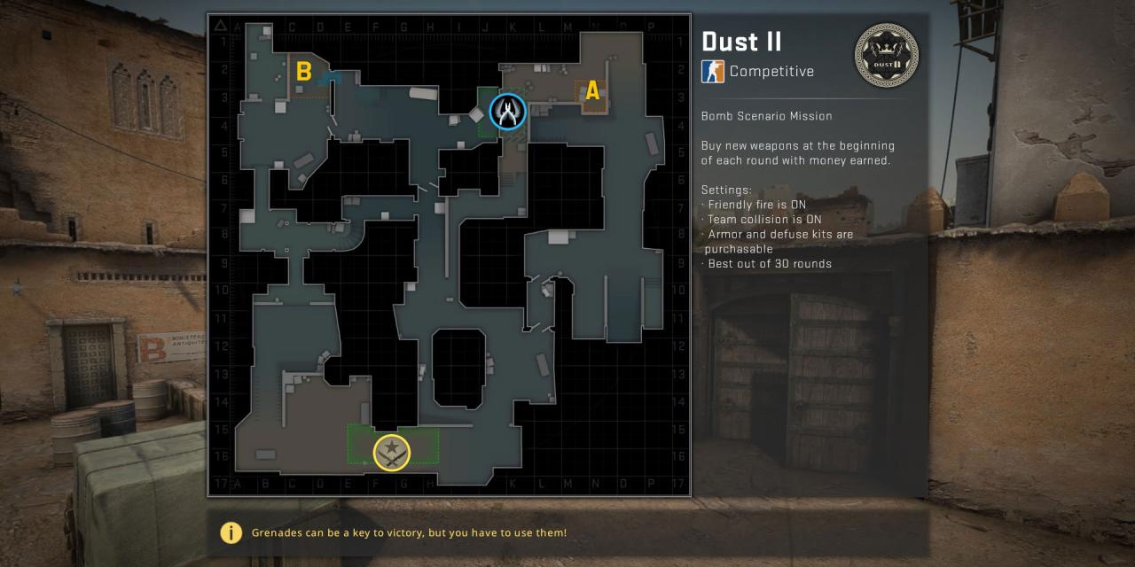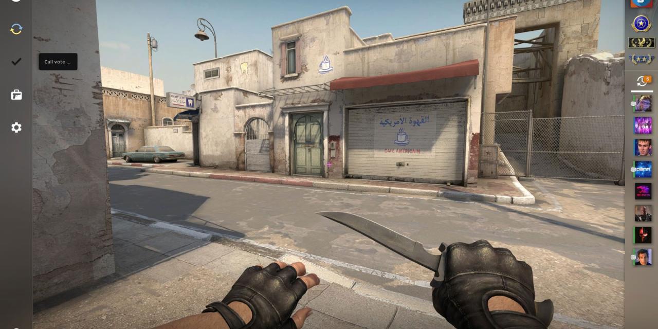


The latest update for Valve's ever-popular competitive shooter, Counter Strike: Global Offensive, has given the game a rather fresh coat of paint that makes for a much more modern-looking gaming experience. Considering Valve has a vested interest in maintaining the popularity of the game moving forward, this seems like a smart play.
Although the UI overhaul is in beta right now, the "Panorama" interface update is well worth exploring if you're a CS:GO fan. It adds new backdrops, new layouts and menu icons, all with lots of pretty transparencies and blur effects to give you something much nicer to look at while you choose weapon skins, character classes and look through your achievements.
When it comes to purchasing new weapons at the start of a new round, there are plenty of changes to make for a prettier and more informative experience there too. You can now see what your teammates money and loadouts are like and there's more detailed statistics for how everyone's playing too, letting you see their headshots and utility damage, among other information.
Perhaps the most welcome change from all of this UI updating though, is it appears to have improved the in-game frame rate. Using modern design principles, Valve has managed to improve things by a few percent points, which in a high-speed game like CS:GO, can make all the difference.
If you want to try out the new beta menu system yourself, you can do so by opting in from the game's properties menu. It's only supportive of bot matches right now, but that will change in the near future.
Thanks to Redditors for the pictures.


