
A video, coming to you straight from an E3 2006 presentation, reveals what the PS3 User Interface will look like and a few of its features while a PS3 secret is also revealed.
A few very polite and skilled assistants were at hand during E3 to demonstrate what the new Sony UI will look like and what options it will offer. The UI, as you can see from video 1 and video 2 is that the design is not that new as it is very similar to that of the PSP UI. That is, of course, a conscious choice as Sony has stressed that it sees the two devices as complimentary. The new UI will also have a very Vista-like appearance with an animated background.
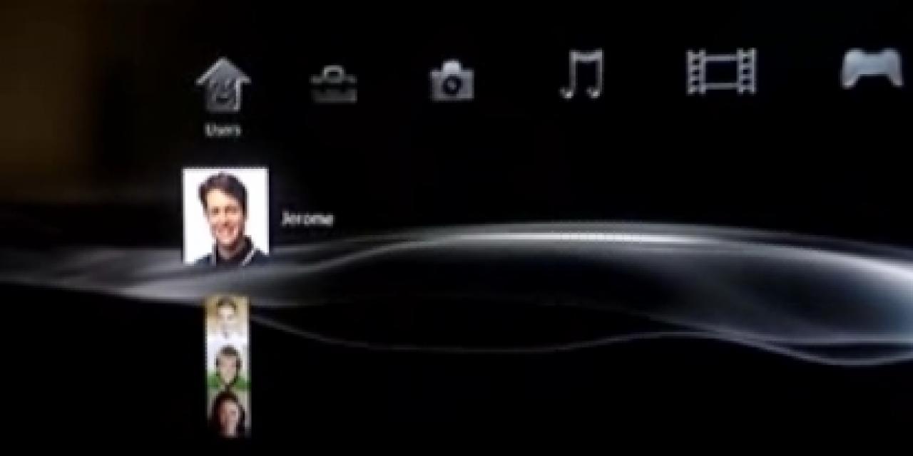
Users will have the usual options but will also feature a Users option which allows you to switch between profiles highlighting Sony's intent to make a machine for the entire family. A Friends option can also be seen, obviously a reminder of Sony's forthcoming, aggressive online policy which will feature a service similar to that of XBox Live.
The UI will also feature a native browser and the helpful booth assistant explains that we will be able to have up to 16 windows up on the PS3 at any one time.
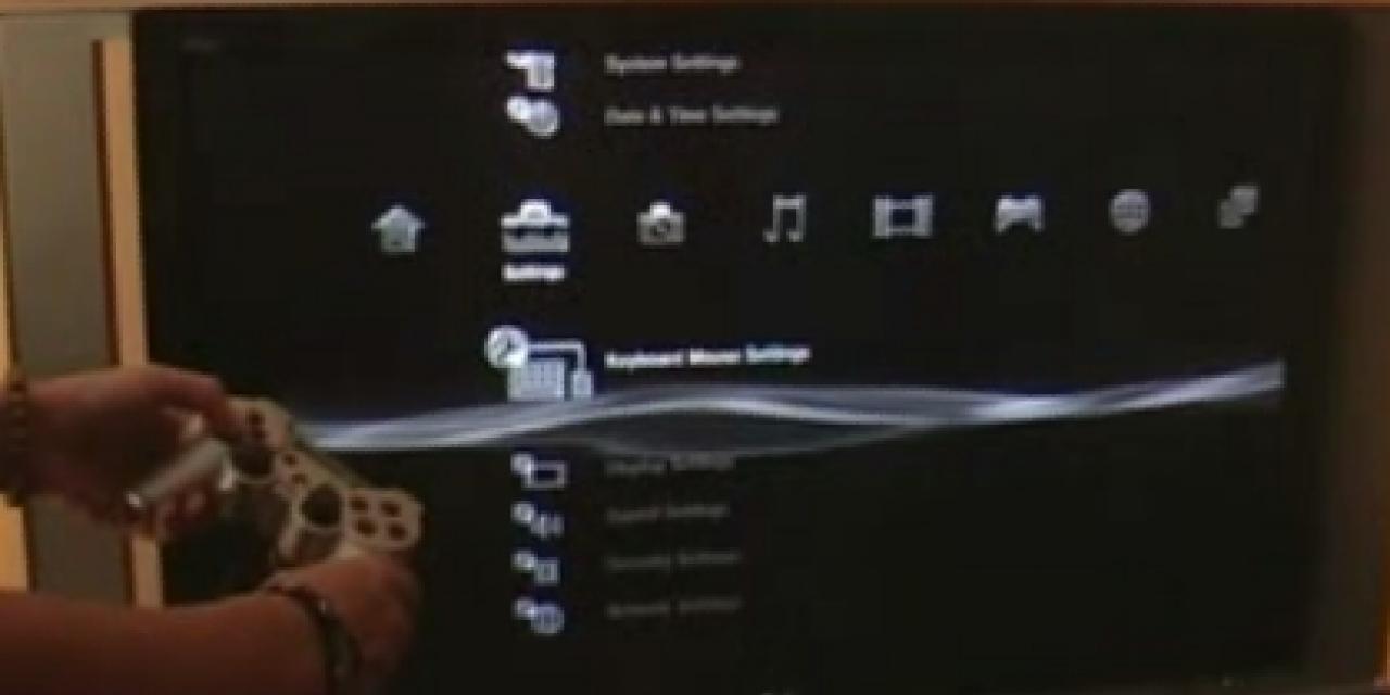
Finally the PS3 secret revealed by the UI is that the keyboard add-on for the console will most probably be available from day one, possibly included in the premium model, since there is a clear option for a keyboard/mouse choice built-in to the UI. You can see that option on the image on your right (if you can't make it out follow the Screens tab above). Sony could of course remove that option before the console launches since the version of the UI we saw is not finished and runs at a much slower pace than the final version will.


