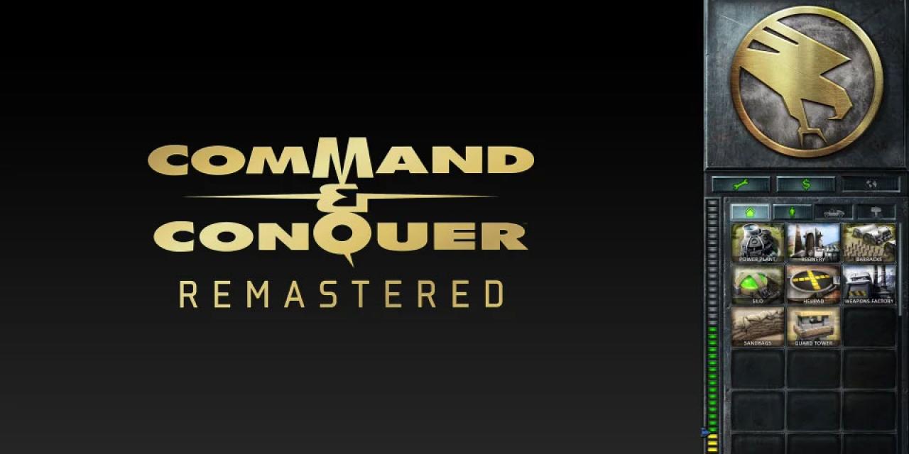
EA is remastering and re-releasing a number of Command and Conquer games, and the first one is set to be the very first game in the franchise. Production is well under way on the recreation of the iconic game and we now have our first look at what the user interface will be like.
Game UIs have evolved a lot over the years. What once saw interfaces fill the majority of a screen has been refined and reduced to much more minimal HUDs and menu-hidden icons to give in-game visuals the broadest of space possible. But CnC Remastered will blend both elements together, offering a classic UI style, but with some of the uplifted visual elements of more modern game interfaces.
While close to a quarter of the screen will still be dominated by the UI, increased resolution and clarity allows for a greater number of on-screen icons. There will be almost no scrolling with the new Command and Conquer interface, placing all building icons within a single, tabbed pane.
Commands like repair, sell, and map now have icons rather than words to further cut down on size, but also to ease localization efforts.Other indicators like available cash and the options menu icon have been moved into the top right too, to further free up the main screen for in-game action.
The overall feel of Tiberian Dawn will remain, and the subsequent release of Red Alert will have the same inspirations from its original title.
The developers posted this update on Reddit and are still interested in feedback and commentary, so if you have any design ideas, be sure to give them a shout.


