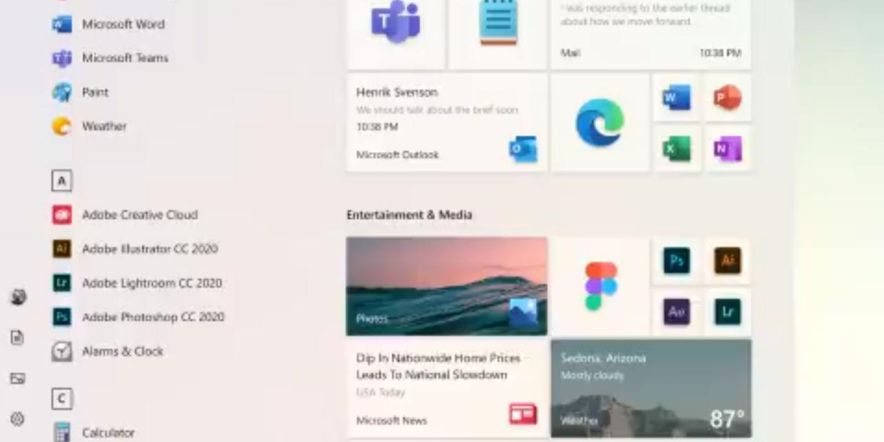
Microsoft is finally moving away from its Live Tiles style from the Start menu, that old holdout from the Windows 8 era that nobody makes use of. While they will still exist to some extent, they'll also be reimagined to a much cleaner interface, with less junk and a focus on what's most important on your PC and the way you use it.
Created by the @Windows design team, this animated clip illustrates a sliver of the #UX evolution and modernization of the Windows experience. Let us know what you think in the comments below! pic.twitter.com/s4SVXncLEo
— Microsoft Design (@MicrosoftDesign) April 6, 2020
The obvious changes to the design include a more seamless color scheme, blending the background and the foreground so everything is more together and connected. There's a dual option of light and dark themes, as well as a smoother integration of the live titles that remain, with a focus on applications that you use, rather than news stories and pictures.
It's not clear yet when this update will be available, or even whether this will come to Windows 10, or as part of Micorosoft's ongoing Core OS developments.
What do you think of the new look Start menu?


