Although it might seem like Steam has always been with us, it's important to remember that as a digital distribution network, as a store, as a games patching service, as a community hub, it's only been around for a decade or so, and has only offered those features for part of that time. It's constantly being worked on though, with Valve updating not only its functions but its form too. The next big Steam update, teased earlier this year, could change the way it looks and behaves forever.
This update has reportedly been in the works for years, with only some hints and teases that it even exists as a project, but as PCGamer highlights, the latest teases could be our best look at the new UI and layout design yet. They're certainly different.
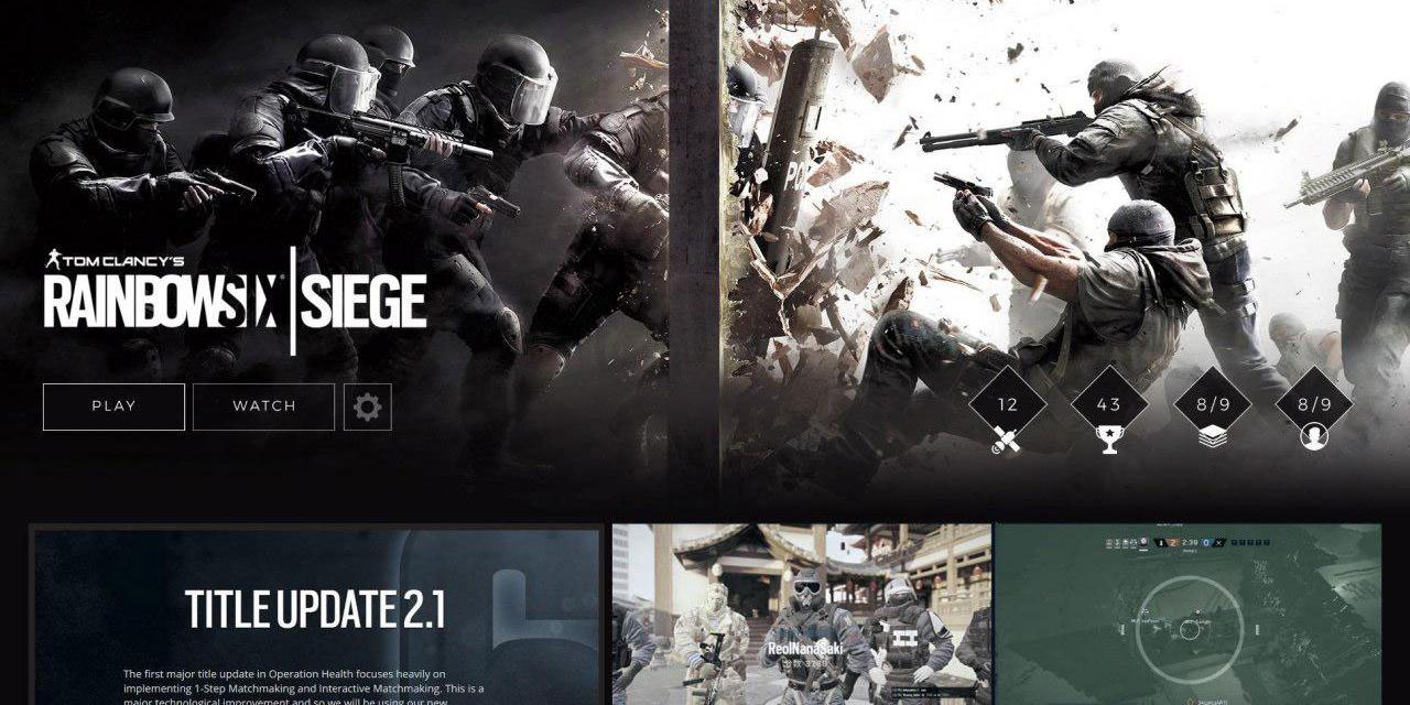
Just remembered that Valve's been working on a Steam redesign for years now. Here's a picture from a presentation in January.
It certainly doesn't look like the SteamU leak from 2 years ago: https://t.co/KjoRK8OnLA pic.twitter.com/2fG2acIIz8— Pavel Djundik (@thexpaw) November 25, 2018
The new design features big, chunky images for game pages showcased in a far less-uniform pattern. Text is constrained to their own boxes, rather than listed down the side in a menu system. It suggests that Valve may be moving to a model that is much more focused on the media related to games, rather than explaining all of the details of the titles up front.
This is somewhat of a surprise as the layout looks drastically different to the leaks we've seen previously. It would suggest a very different way of laying out pages, although the image does appear heavily cropped, so it may be that we're only looking at a segment of what the new Steam design might look like.
What do you think of how the update looks?


