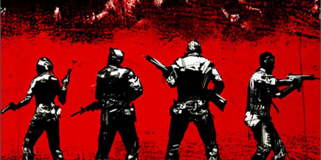
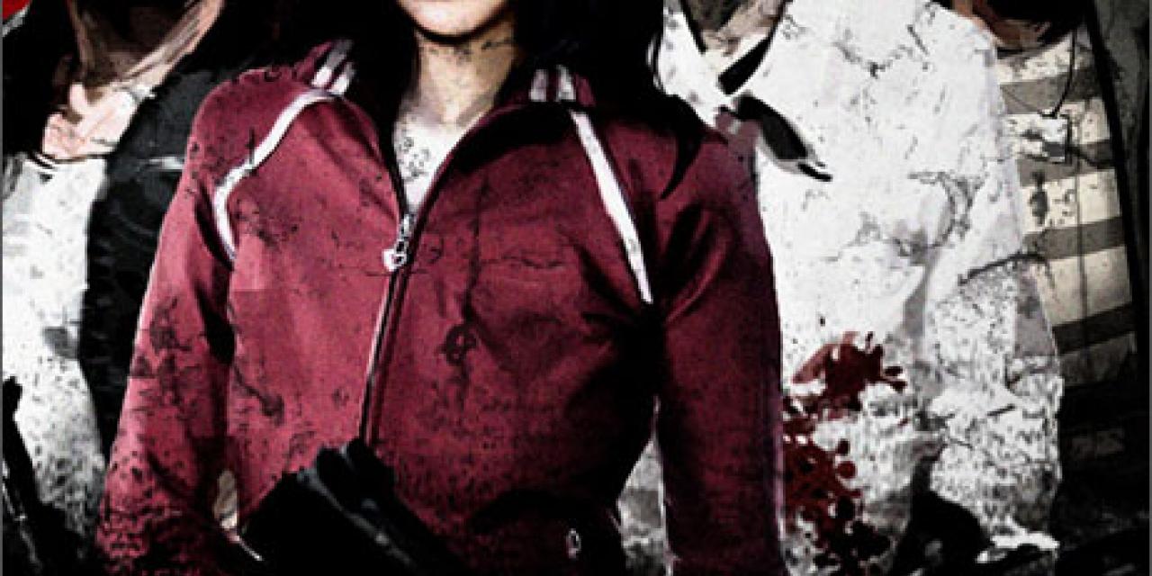
On the game's official blog, Valve artist Jeremy Bennett revealed how Left 4 Dead box art came to be.
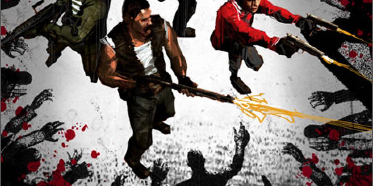
The initial Left 4 Dead cover art focused on the game's four heroes, Bill, Louis, Francis and Zoey. Typically, for a video game (or DVD or book) cover to be eye-catching, there'll be a single prominent element front and center- the "hero" character, for example, with ancillary characters standing around in the background. Problem is, Left 4 Dead is a multiplayer game with emphasis on team work; there is no "hero".
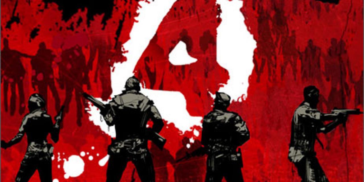
The design team then tried spacing the four characters out at equal size. This solved the problem of portraying one character as the main hero, but it wasted a lot of box real estate without showing any zombies.
Next, the team shrank the heroes even more in order to cram some zombies into the picture. These attempts did a good job of capturing the multiplayer aspect of L4D, not to mention the intensity of the gameplay experience. But when viewed from a distance - by someone walking through a game store and spotting it on a shelf, for instance - it just looked like cluttered noise. The individual elements were too small and varied to communicate anything visually interesting.
Seeing that the characters has to be small, the design team decided to make the game's title occupy as much space as possible of the cover box. Unfortunately, this ran up against the same problems. Box art that's all text doesn't grab the eye, no matter how stylishly it's laid out. More importantly, it didn't look like a game box.
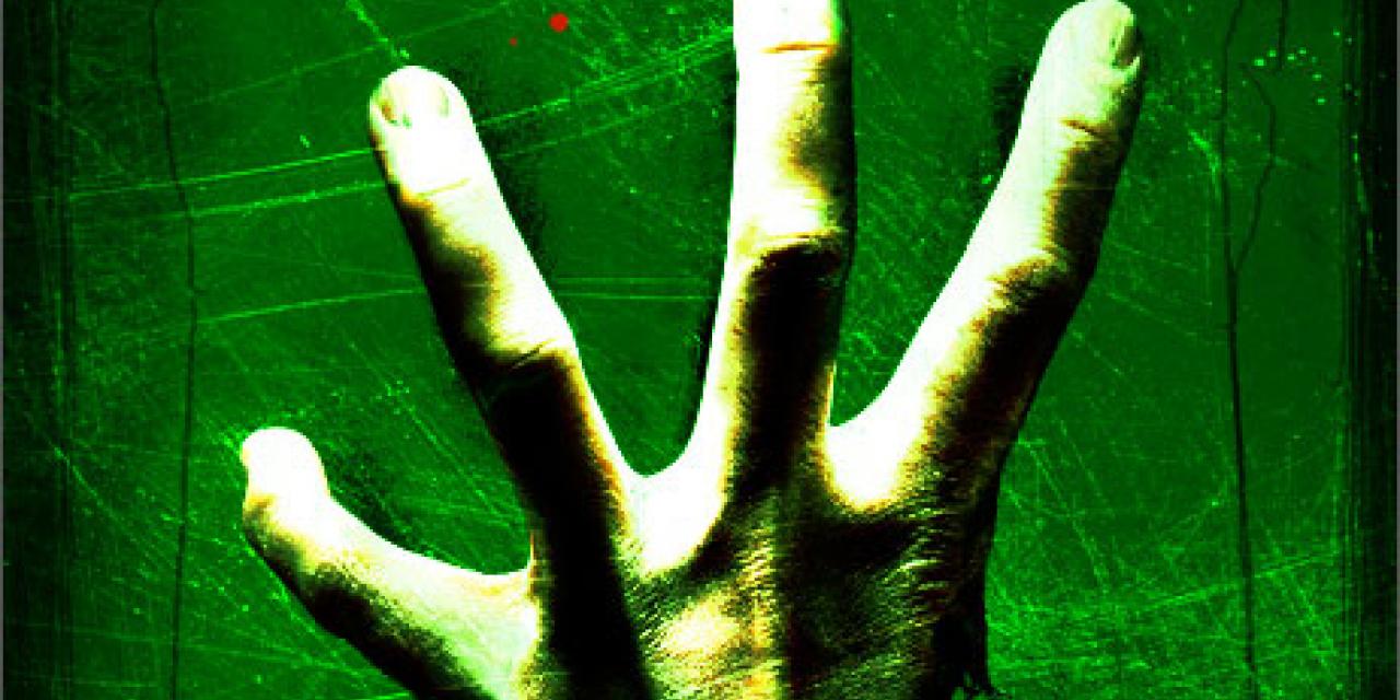
Finally, the team paid a visit to GameStop where they noticed that lots of games use the black and red color scheme in their box art. This meant that a black and red game box won't grab buyers' attention. The team did a little research and decided that green should be their main color.
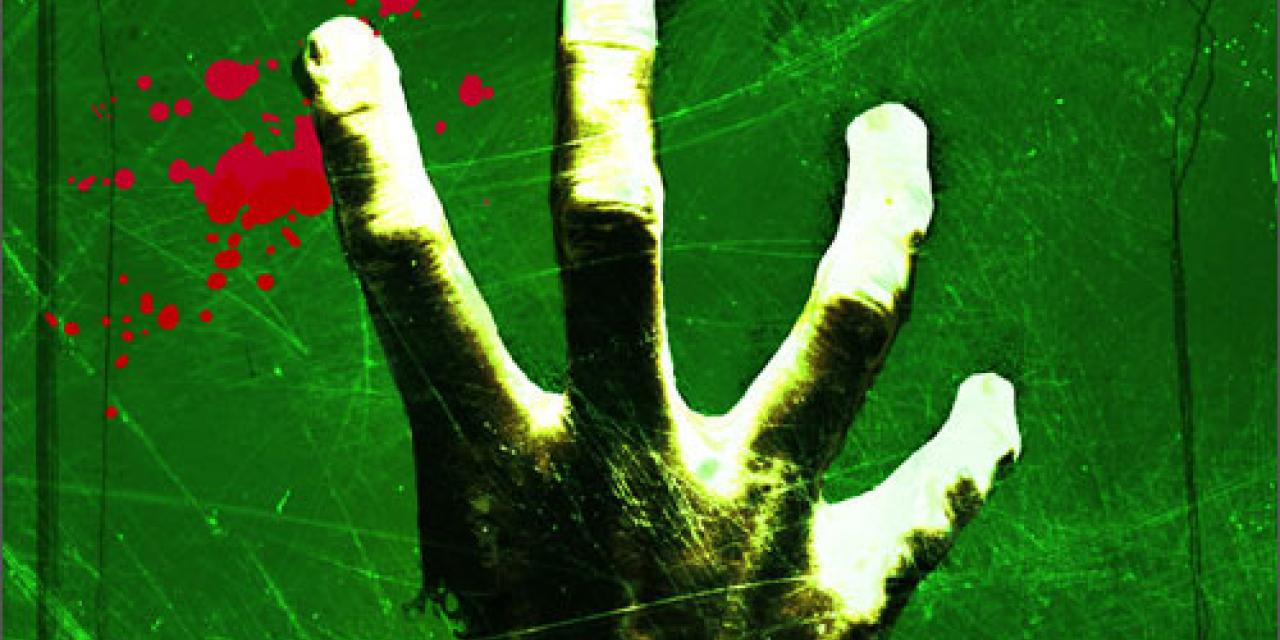
"We had further success once got away from the clutter of our various 'Survivors vs. Zombies' attempts, focusing on the simple idea of selling the idea of 'four' itself in an iconic, visually compelling way," wrote Bennett. "At some point the idea sprung up of a hand-its thumb chewed off by zombies, with only four fingers left-and it stuck."
"All of the noise instantly evaporated. Suddenly we had this horrific, easily graspable image, visible from far away, that managed to get across the core concepts of the game all in one go: Zombies. Four. Danger."
The final piece of the puzzle came from a Left 4 Dead fan who saw the box at E3 and took less than three seconds to point out that if the four-fingered hand was a left hand instead of a right one, we could get a nice pun, with all three words of the game's title presented visually.
Be sure to hit the screens tab where you can see all six Left 4 Dead covers.


