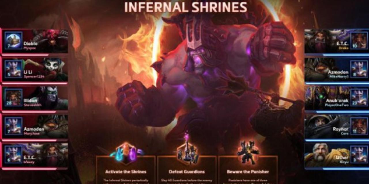
For a game that was designed to build off of the MOBA platforms that had been developed by Riot Games and Valve, Heroes of the Storm did pretty well to speed up gameplay, reduce down time and change up the formula with the alternating maps. But there was always one aspect of it that felt archaic in comparison to the other big games: the loading screens.
Typically in DotA 2 and League of Legends, players can see their own loading bar, the loading bars of their teammates and opponents, the champions everyone is playing and details on their special spells and abilities. While that latter aspect isn't present on Heroes of the Storm's new loading screens, just about everything else is.
Now you can see just why the game is taking an age to load, who's responsible and... then you can attack them in-game to let them know how annoying that is. I'm being facetious here of course, but there is some concern that letting everyone know who has the slowest machine is likely to encourage some toxic elements.
Still, being able ot see who you're going up against is important as it can impact lane placement and it's always good to get a reminder of who's on your side, their names and other information.
When it comes to MOBAs, more data is more gooder.
[Thanks Kotaku]


